Filters
Availability
Features
Platform
Programming skills
Type of data
Visualization
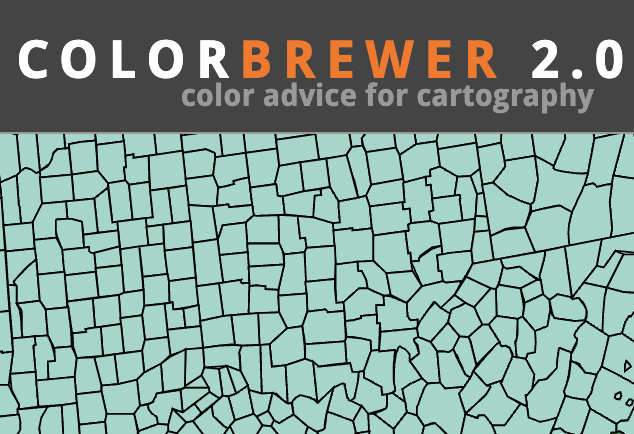
ColorBrewer
https://colorbrewer2.org/
Intended for use as a diagnostic tool for evaluating the robustness of individual colour schemes.
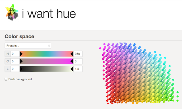
iWantHue
https://medialab.github.io/iwanthue/
Colors for data scientists. Generate and refine palettes of optimally distinct colors.
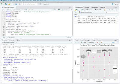
RStudio
https://rstudio.com/
RStudio is an integrated development environment for R, a programming language for statistical computing and graphics.
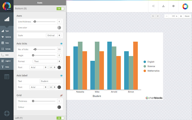
ChartBlocks
https://www.chartblocks.com/en/
Build a chart in minutes in the easy to use chart designer, choosing from dozens of chart types and then customising it to your needs.

Gephi
https://gephi.org/
Gephi is an open-source network analysis and visualization software package written in Java on the NetBeans platform.
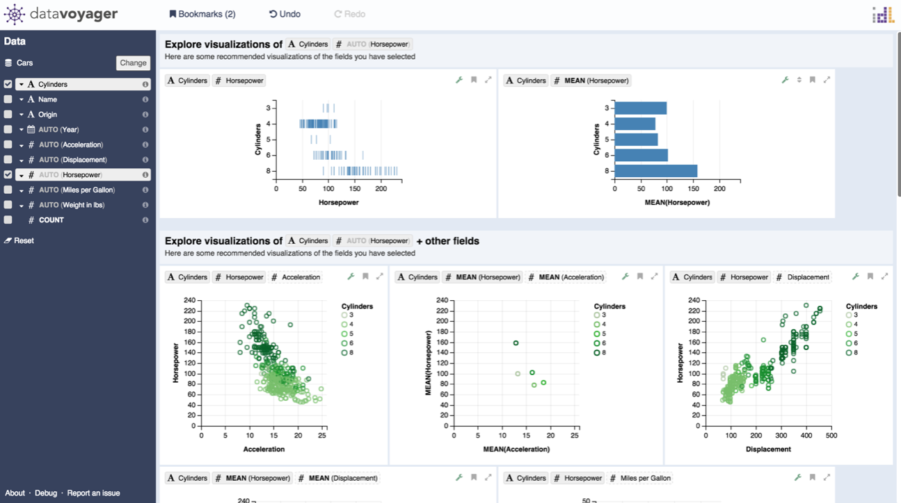
Vega-Lite
https://vega.github.io/vega-lite/
Vega-Lite is a high-level grammar of interactive graphics. It provides a concise JSON syntax for rapidly generating visualizations to support analysis. Vega-Lite specifications can be compiled to Vega

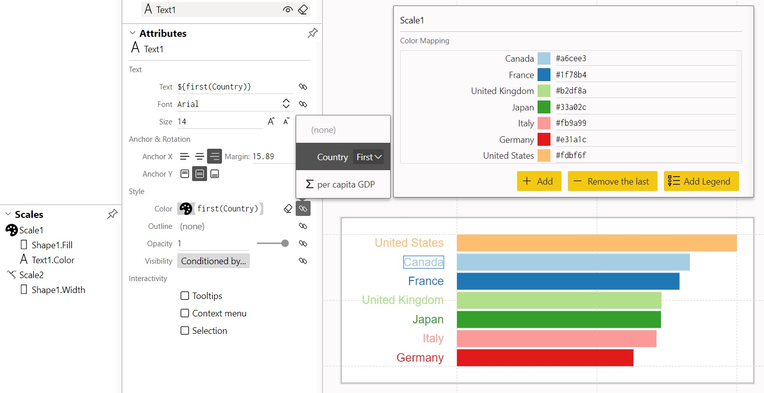
Data Illustrator
http://data-illustrator.com/
Create infographics and data visualizations without programming.
Charticulator
https://charticulator.com/index.html
Allows you to create bespoke chart designs without the need for any programming.
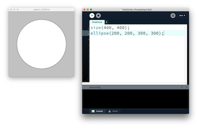
Processing
https://processing.org/
Processing is a flexible software sketchbook and a language for learning how to code within the context of the visual arts.
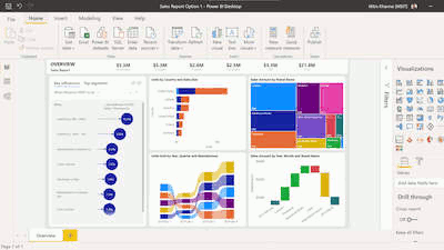
Power BI
https://powerbi.microsoft.com/
Power BI is a collection of software services, apps, and connectors that work together to turn your unrelated sources of data into coherent, visually immersive, and interactive insights.
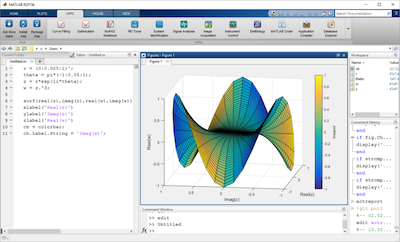
MATLAB
https://uk.mathworks.com/products/matlab.html
MATLAB allows matrix manipulations, plotting of functions and data, implementation of algorithms, creation of user interfaces, and interfacing with programs written in other languages.
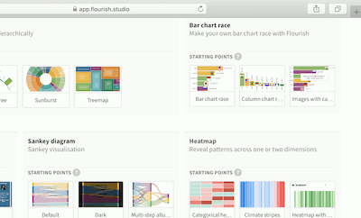
Flourish
https://app.flourish.studio/
Quickly turn your spreadsheets into online charts, maps or interactive stories. No coding required.
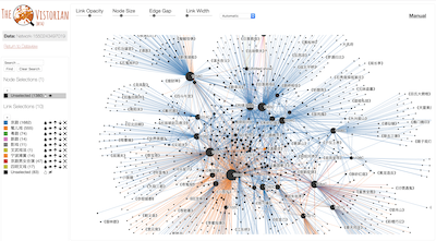
The Vistorian
https://vistorian.net/
Interactive Visualizations for Dynamic and Multivariate Networks.
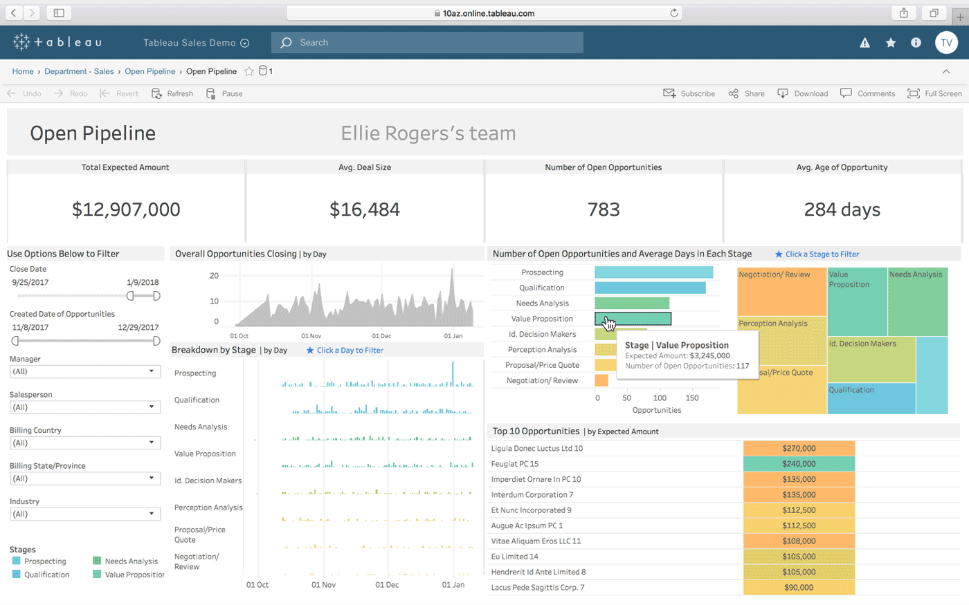
Tableau Desktop
https://www.tableau.com/en-gb/products/desktop
Tableau Desktop is a powerful data visualization tool used for data science and business intelligence.
Sketch
https://www.sketch.com/
Sketch is a vector graphics editor for macOS. Sketch is used primarily for designing the UI and UX of mobile apps and web.
Raw Graphs
https://rawgraphs.io/
RAW Graphs is an open-source data visualization framework designed to make visualising complex data easy for everyone.

Datawrapper
https://www.datawrapper.de/
Datawrapper is an open-source web tool that you can use to create basic interactive charts.
QGIS
https://qgis.org/
QGIS functions as geographic information system (GIS) software, allowing users to analyze and edit spatial information, in addition to composing and exporting graphical maps.
Adobe Illustrator
https://www.adobe.com/ie/products/illustrator.html
Illustrator is vector-based design software.
Inkscape
https://inkscape.org
Inkscape is a free and open source vector graphics editor. It is widely used for both artistic and technical illustrations such as cartoons, clip art, logos, typography, diagramming and flowcharting.
GraphPad Prism
https://www.graphpad.com/scientific-software/prism/
"The Fastest Way to Elegantly Graph and Share Your Work"
TIBCO Spotfire
https://www.tibco.com/products/tibco-spotfire
Data visualisation and analytics platform.
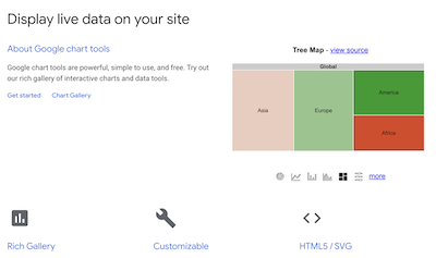
Google Charts API
https://developers.google.com/chart
The Google Visualization API allows you to create charts and reporting applications over structured data and helps integrate these directly into your website.
Grasshopper - plug-in for Rhino 6.0
https://www.rhino3d.com/6/new/grasshopper
Generative design software using visual coding system of using nodes and linkages. Excellent range of plug-ins for weather, heat, building visualisation,
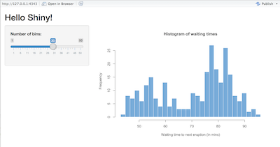
Shiny
https://shiny.rstudio.com/
Shiny is an R package that makes it easy to build interactive web apps and dashboards straight from R.

ArcGIS Online
https://www.arcgis.com/home/index.html
ArcGIS Online is a web GIS that allows you to use, create, and share maps, scenes, apps, layers, analytics, and data.
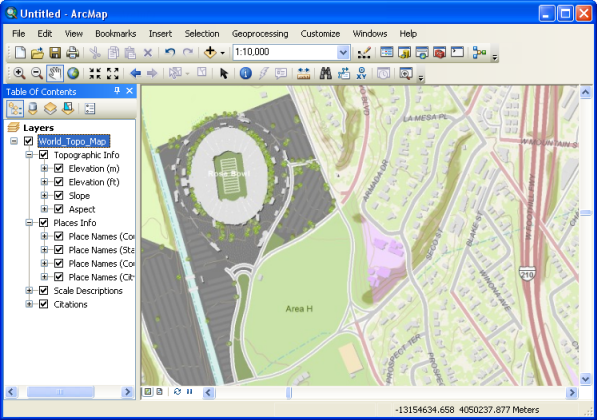
ArcGIS Desktop
https://www.esri.com/en-gb/store/arcgis-desktop
Desktop geographic information system (GIS) application that supports viewing, editing, and analysis of geospatial data.
Exploratory
https://exploratory.io/
UI for Data Science. Data Wrangling, Data Visualization, Analytics (Statistics / Machine Learning), and Communication (Dashboard / Note / Slides).
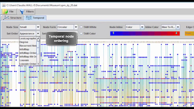
Dynamic Network Visualization (DyNetVis)
https://www.dynetvis.com/
DyNetVis is an interactive software tool for the visualization of dynamic networks, providing three different layouts, such as structural and temporal, and matrix.
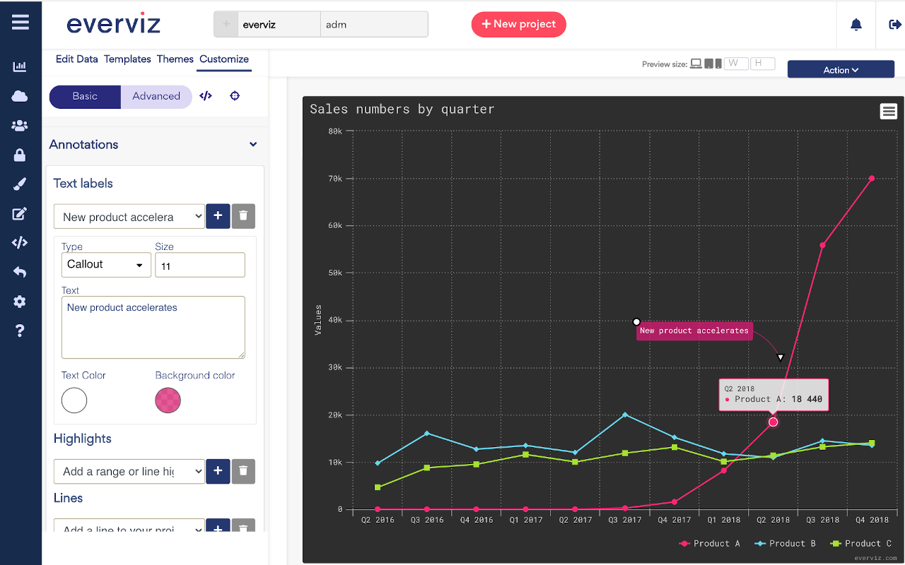
everviz
https://www.everviz.com
everviz helps journalists, researchers and content creators to tell more engaging stories with interactive, responsive and accessible (a11y) visualizations.
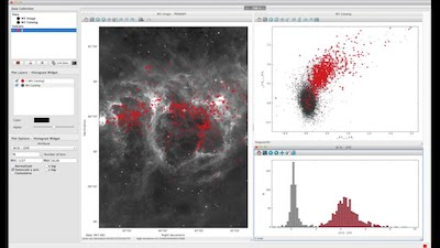
glue
https://glueviz.org/
The glue multi-dimensional linked-data exploration software (https://glueviz.org/) is an open-source Python tool to explore relationships within and between related datasets.
MuzeJS Visualization
https://muzejs.org/
Create Tableau-like data visualizations in JavaScript - powered by WebAssembly
KNOWAGE
https://www.knowage-suite.com/site/
Knowage is the open source full suite for data visualization and data analysis over any kind of data.
Seaborn
http://seaborn.pydata.org/index.html
Seaborn is a library for making statistical graphics in Python. It builds on top of matplotlib and integrates closely with pandas data structures.
DC.js
https://dc-js.github.io/dc.js/
dc.js is a Javascript charting library designed for highly efficient exploration of large multi-dimensional datasets.
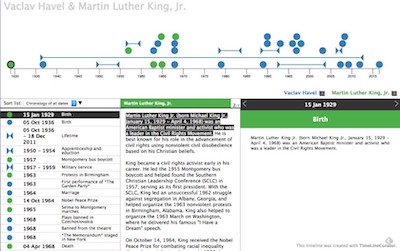
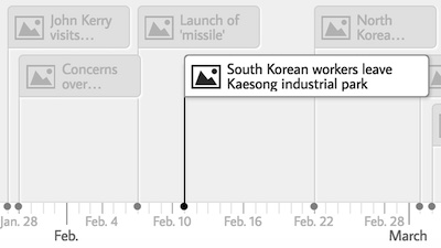
TimeLineCurator
http://timelinecurator.org/
TimeLineCurator is a browser-based tool that automatically extracts temporal references from text documents using natural language processing and displays them along a visual timeline
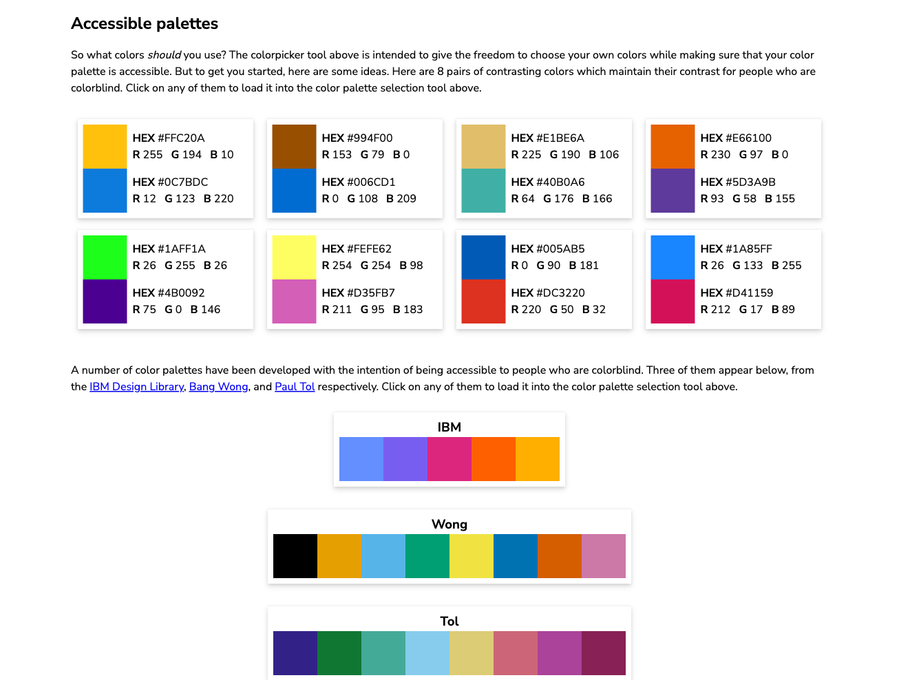
Coloring for Colorblindness
https://davidmathlogic.com/colorblind/
A web tool to test colour palettes against different types of colour-blindness. Also includes a few established defaults and links to further resources.
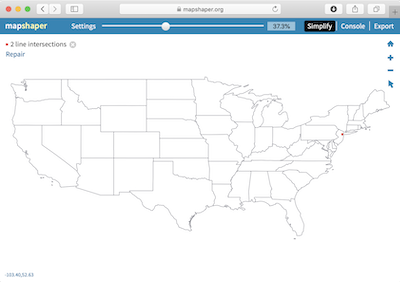
Mapshaper
https://mapshaper.org/
Mapshaper is web tool for editing Shapefile, GeoJSON, TopoJSON, CSV and several other geo-spatial data formats. Mapshaper supports essential map making tasks like simplifying shapes, editing attribute
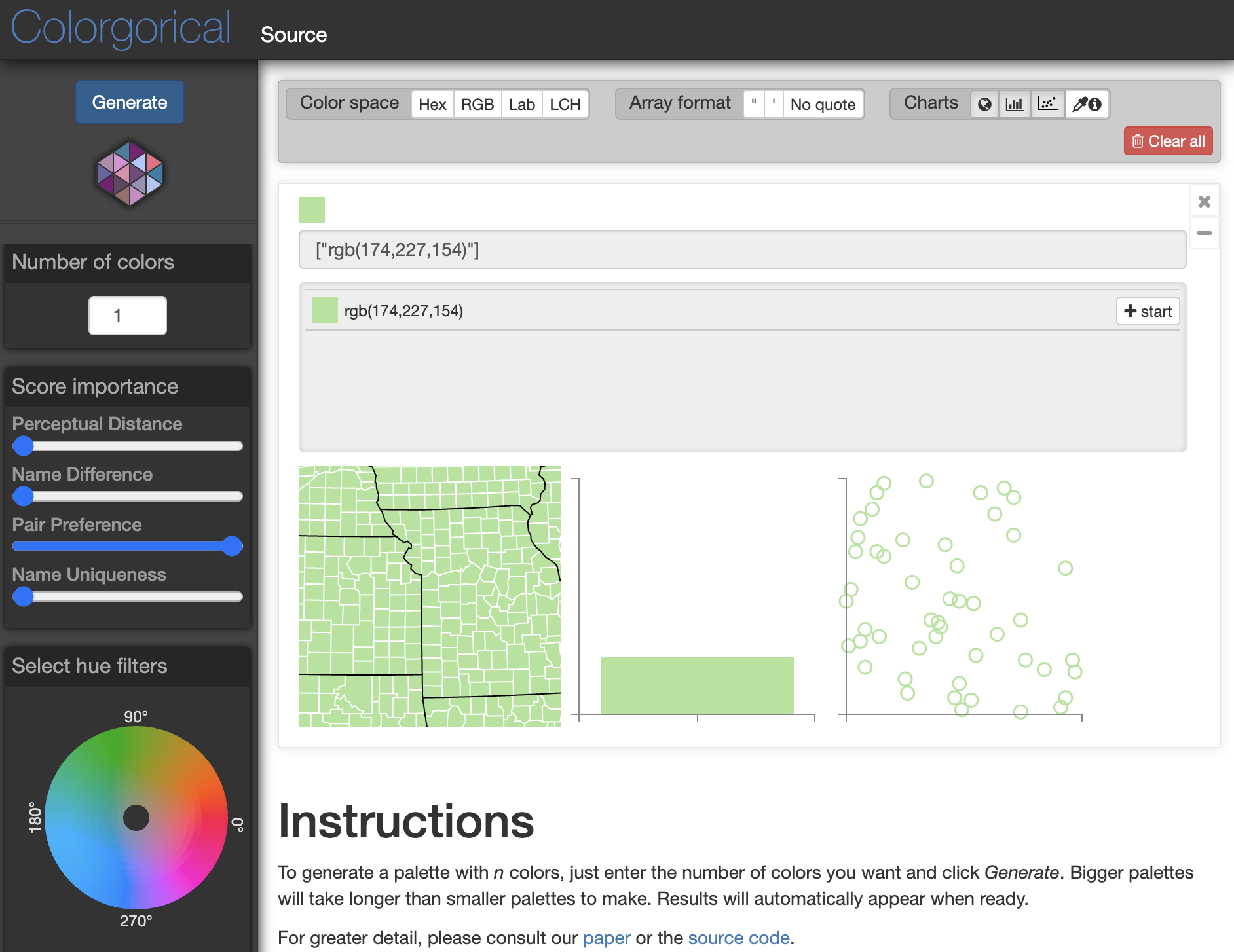
Colorgorical
http://vrl.cs.brown.edu/color
Generate a color palette for n colours that are perceptually distant.

Observable
https://observablehq.com/
Observable is a platform where you can collaboratively explore, analyze, visualize, and communicate with data on the web.
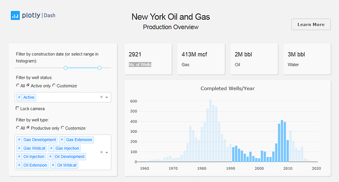
Plotly Dash
https://plotly.com/dash/
For building web-based analytic apps without the need for JavaScript.

Data Viz Projects
https://datavizproject.com/
You enter your facets - type of data, structure of data set, what you want to achieve - and the tool suggests a suitable visualization type - chart, map, etc.

Vis Palette
https://projects.susielu.com/viz-palette
Born out of a frustration with picking colors for data visualizations. This project is optimized for tweaking, copying, and pasting in and out of JavaScript.
Made by Susie Lu & Elijah Meeks
Select a tool to view details.